Visualizations in Power BI – types and their use in business analysis
In a business environment, data on its own does not yet have value. Only proper interpretation allows organizations to draw conclusions and make informed decisions. Visualizations in Power BI play a key role here, as they enable quick identification of relationships, trends, and anomalies hidden in the data.
Power BI offers a wide range of visualizations that make it possible to transform complex data from multiple sources into clear and consistent business reports. Properly selected Power BI visualizations support the analysis of, among others:
- sales results and margins,
- operational costs,
- goal and KPI performance,
- efficiency of business processes.
For management teams and analytical departments, this means access to real-time information without the need for manual analysis of tables or spreadsheets. Visualizations in Power BI allow users to focus on data interpretation rather than data processing.
In the following sections of this article, we will discuss the different types of Power BI visualizations and show which business scenarios they are best suited for.
Basic types of visualizations in Power BI
Power BI offers a set of core visualizations that form the foundation of most business reports. These are the visuals most commonly used in operational and management analyses, as they allow users to quickly compare data, identify trends, and analyze result structures.

Column and bar charts
Column and bar charts are among the most frequently used visualizations in Power BI. They work particularly well wherever comparing values across categories or analyzing changes over specific time periods is essential.
Use in comparing values and trends
These types of Power BI visualizations enable clear comparisons of data such as:
- sales results by product or region,
- costs broken down by cost centers,
- KPI performance across consecutive periods.
Analysis of sales results, costs, and KPIs
Thanks to filtering and interactivity, users can quickly move from a high-level overview to detailed analysis, significantly reducing the time required to interpret data.
Line and area charts
Line and area charts are essential for time-based analyses. They allow organizations to observe changes over time and identify long-term trends.
Analysis of changes over time
These visualizations in Power BI are particularly useful when analyzing:
- month-over-month revenue,
- year-over-year costs,
- budget plan execution.
Monitoring trends and seasonality
Line charts make it easy to quickly identify seasonality, anomalies, or sudden changes that may require a business response.
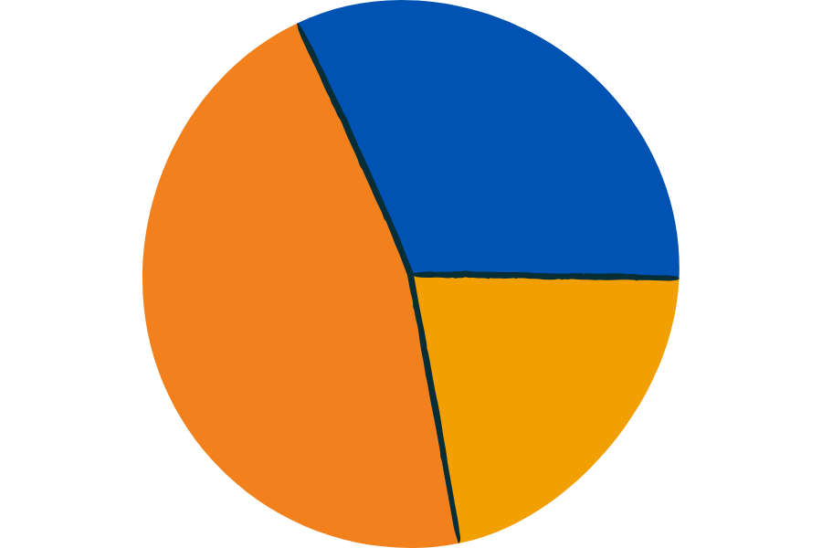
Pie and donut charts
Pie and donut charts are used to present data structure and the percentage share of individual elements.
Percentage shares and data structure
These Power BI visualizations work well for:
- analyzing sales structure,
- showing the share of costs in total expenses,
- breaking down revenue by channels.
When to use them—and when to avoid them
It is worth remembering that pie charts are effective only with a small number of categories. For more complex datasets, bar charts or tables are usually a better choice.

Tables and matrices
Tables and matrices remain indispensable when detailed data analysis is required.
Detailed data analysis
They allow report users to analyze data at the transactional level without losing business context.
Working with hierarchies and aggregations
Matrices in Power BI enable work with hierarchies (e.g., year → quarter → month) and dynamic data aggregation, which is particularly important in financial and controlling reports.
Advanced visualizations in Power BI
Advanced visualizations in Power BI help focus the viewer’s attention on key indicators and relationships between data points.
KPI cards and indicators
KPI cards provide immediate insight into the most important metrics, such as revenue, margin, or goal achievement levels.
Monitoring goal performance
Thanks to conditional formatting and visual thresholds, users can instantly see whether values fall within predefined ranges.
Maps
Maps in Power BI allow data to be analyzed in a geographic context, which is especially important for organizations operating across multiple markets.
Sales results, logistics, and operational reach
This type of visualization is commonly used in sales, logistics, and operational analyses.
Combo charts
Combo charts make it possible to present several measures at once, such as revenue and margin.
Analyzing relationships between data
This allows users to better understand relationships between key business indicators.
Custom visualizations (custom visuals)
Power BI enables organizations to extend standard reporting capabilities through custom visuals.
Examples of using custom visualizations
They are often used in:
- financial reports,
- process analyses,
- management dashboards.
When to use custom visuals
Custom visuals make sense when standard Power BI visualizations do not provide sufficient clarity or functionality. In other cases, it is usually best to rely on native Power BI visuals.
How to choose the right visualization for a business objective
Selecting the right visualization in Power BI should not be an aesthetic decision, but an analytical one. Each visualization should answer a specific business question and support users in interpreting data correctly.
Matching visualizations to the type of data
The type of data largely determines which Power BI visualizations will be the most effective. Time-based, categorical, or percentage data each require a different approach to presentation.
For example:
- time-based data is best presented using line charts,
- comparisons between categories work well with bar or column charts,
- data structure and percentage shares require simple and clear visualizations.
A well-chosen visualization makes data easier to understand and reduces the risk of misinterpretation.
The report audience and the form of information presentation
A report prepared for executive management should look different from one designed for operational teams. Visualizations in Power BI must be aligned with the level of detail expected by the audience.
- Executives expect high-level dashboards and KPI indicators.
- Analytical teams need the ability to drill down into data and access detailed views.
- Finance departments often require tables and matrices with hierarchies.
Adapting the form of visualization to the audience increases the usability of the report and its real business value.
The most common mistakes in visualization selection
The most frequent mistakes when working with Power BI visualizations include:
- using too many different types of visualizations within a single report,
- choosing visualizations that are not suited to the type of data,
- overcrowding a dashboard with excessive information.
Avoiding these issues helps create reports that are clear, intuitive, and easy to interpret.
Best practices for designing visualizations in Power BI
Designing visualizations in Power BI requires not only technical knowledge of the tool, but also an understanding of data analysis principles and information perception.
Clarity and simplicity
One of the most important principles is simplicity. Visualizations in Power BI should communicate information clearly, without unnecessary elements that distract the user.
This includes, among others:
- limiting the number of colors,
- avoiding redundant labels,
- arranging report elements in a logical layout.
The simpler the visualization, the faster users can draw conclusions.
Visual consistency of the report
Visual consistency plays a crucial role in business reports. A unified color scheme, typography, and consistent use of visualization types help build trust in the data.
As a result, Power BI visualizations are perceived as part of a single, coherent reporting system rather than a collection of unrelated charts.
Performance and scalability of reports
In real-world business environments, Power BI reports often operate on large data volumes. Poorly designed visualizations can negatively impact report performance.
For this reason, it is recommended to:
- limit the number of visualizations on a single page,
- use aggregations instead of detailed data where possible,
- design reports with future expansion in mind.
Summary
Choosing the right visualizations in Power BI has a direct impact on the quality of analyses and the decisions based on them. Power BI visualizations are not merely an aesthetic element of a report, but a key analytical tool.
- Well-designed visualizations:
- make data easier to interpret,
- reduce analysis time,
- support fact-based decision-making.
Thanks to its wide range of visualization options and customization capabilities, Power BI plays an important role in building a data-driven culture within organizations. Proper use of visualizations allows companies to leverage data effectively as real support for business decision-making.